When creating web images, important factors to consider are the image size, resolution, and aspect ratio.
The maximum width of an image is 1920 px, while 768 px is crucial for mobile optimization. Common aspect ratios include 16:9 (monitor), 1:1 (social media), and 1:1.618 (golden ratio).
Web Image Size Guide
The width of web images is as follows:
- Maximum width: 1920 px (Full HD resolution)
- Optimized for fixed width: 1280 px (optimized for desktop view)
- Mobile-friendly width: 768 px (optimized for various mobile devices)
The height is not strictly limited due to scrolling, but maintaining a standard aspect ratio is recommended.
Web Image Aspect Ratio Guide
Below are commonly used image aspect ratios and example sizes. Each ratio is optimized for specific uses. For instance, the 16:9 ratio is suitable for computer monitors, while the 1:1 ratio is ideal for social media profiles.
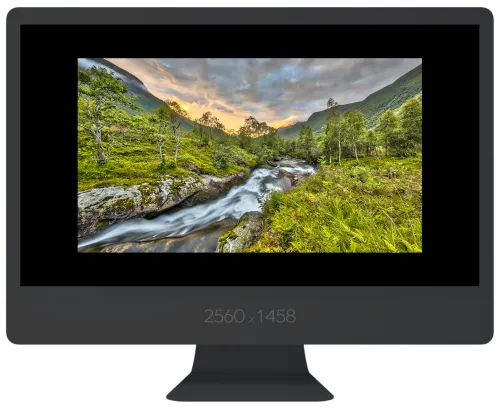
Computer Monitor (16:9)
Aspect Ratio: 16:9
Example Sizes: 889 x 500 px, 1280 x 720 px, 1920 x 1080 px
Best for computer monitors and Full HD video content.
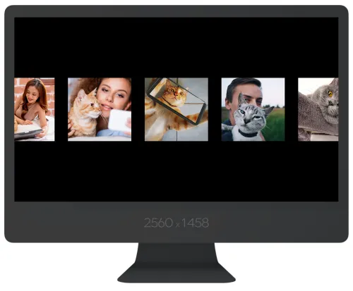
Social Media Profiles and Posts (1:1)
Aspect Ratio: 1:1
Example Sizes: 500 x 500 px, 1080 x 1080 px
Used for profile images and posts on Instagram, Facebook, and X (Twitter).
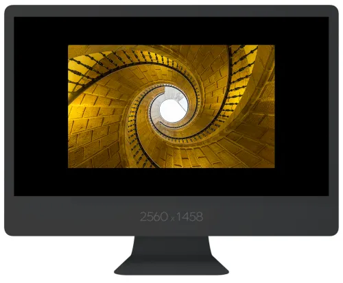
Golden Ratio (1:1.618)
Aspect Ratio: 1:1.618
Example Sizes: 840 x 500 px, 1680 x 1000 px
Emphasizes beauty in artwork and graphic design.
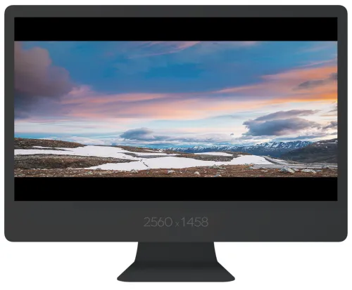
Ultra-Wide (2.37:1)
Aspect Ratio: 2.37:1
Example Sizes: 1185 x 500 px, 2560 x 1080 px
Enhances immersion in movies and gaming screens.
Old Monitors and TVs (4:3)
Aspect Ratio: 4:3
Example Sizes: 667 x 500 px, 1024 x 768 px
Suitable for old CRT monitors and presentation slides.
35mm Film (3:2)
Aspect Ratio: 3:2
Example Sizes: 750 x 500 px, 1080 x 720 px
Provides a natural composition for film cameras and DSLRs.
Credit Card (1:1.56)
Aspect Ratio: 1:1.56
Example Sizes: 780 x 500 px, 1560 x 1000 px
Used for credit card and brochure designs.
A4 Paper (1:1.414)
Aspect Ratio: 1:1.414
Example Sizes: 707 x 500 px, 1414 x 1000 px
Suitable for documents and photo printing.
Latest Web Image Trends and Optimization Strategies
According to the latest web image trends, implementing responsive images using the CSS srcset attribute is essential. This feature allows support for various screen sizes and maintains image quality on high-resolution devices.
Additionally, converting images to Google's WebP format is highly recommended for reducing file sizes. WebP offers smaller file sizes while maintaining high quality compared to JPEG or PNG.
Defining image dimensions in pixels (px) significantly contributes to optimizing web page loading speeds, while maintaining the aspect ratio prevents distortion. Lastly, the resolution, measured in DPI (dots per inch) or PPI (pixels per inch), plays a crucial role in image quality. While 72 DPI is standard for web images, higher resolutions, such as 150 DPI or above, are increasingly used for high-resolution screens.
For detailed information on screen sizes for web design, refer to 'Homepage and Website Design Sizes'.