Considering the media resolutions of current internet users, the appropriate homepage width for desktop PCs is between 1024 pixels and 1920 pixels, for smartphones between 360 pixels and 768 pixels, and for tablets between 768 pixels and 1024 pixels. Narrowing down the range, it is recommended to have 1200 pixels for PC, 820 pixels for tablets, and 390 pixels for mobile.
Referring to the screen resolution statistics of South Korea over the past year, the width rankings are 1920 pixels, 390 pixels, 2560 pixels, and 412 pixels. For more details, refer to Screen Resolution Stats Republic Of Korea (Apr 2023 - Mar 2024).
Desktop PC
Referring to the breakpoints of the popular responsive framework 'Bootstrap', desktop PCs can use page widths of 1400 pixels or more (Larger Desktops), 1200 pixels or more (Large Desktops), and 992 pixels (Desktops) as a guideline. Therefore, the global navigation at the top of the page should not exceed 1200 pixels, and the content's maximum width should be within 1400 pixels while reducing the width to about 992 pixels to maintain the layout for smaller devices like laptops. For images that adjust to the page width, it is recommended to create them with a width of at least 1920 pixels.
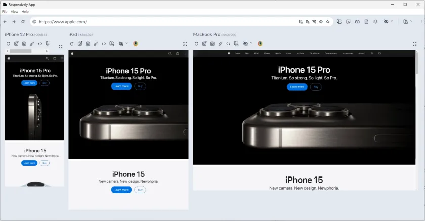
MacBook Pro, 1440x900

This is the Apple website as seen on a MacBook Pro with a resolution of 1440 x 900 pixels. The top global navigation section is 992 pixels wide, and the main hero image fits well at 1440 pixels. For high-resolution displays, the main hero image of the iPhone uses an image with a width of 6016 pixels. When using such large images, be careful not to make the file size too large. The image on the Apple site is about 358KB, and it is recommended to keep the file size within a few hundred KB.
Surface Pro 7, 912x1368

The layout of the top menu of the Apple site is well maintained even on the 'Surface Pro 7', a tablet close to a laptop.
Tablet

This is the screen as seen on the iPad Pro (1024x1366), iPad Air (820x1180), and iPad (768x1024). According to Bootstrap breakpoints, the tablet layout starts at a width of 992 pixels. On the iPad Pro screen, the same top menu as on the PC is maintained, but on the iPad Air, the top menu optimized for mobile devices is displayed.
Smartphone

This is the screen as seen on iPhone 14 Pro Max (430x932), iPhone 12 Pro (390x844), iPhone 6/7/8 (375x667), and iPhone 5/SE (320x568). According to Bootstrap breakpoints, all devices with a width of less than 768 pixels are applicable. Considering the iPhone 5/SE's width of 320 pixels is no longer supported, it is recommended to design based on a width of 390 pixels to avoid issues at 360 pixels.
Landscape Mode
The vertical length of the iPhone 5/SE is 568 pixels, and the iPhone 12 Pro is 844 pixels. In landscape mode, the vertical length becomes the width. In the following images, the first is the landscape mode of the iPhone 12 Pro, and the last is the landscape mode of the iPhone 5/SE. Responsive web technology applies the appropriate tablet and PC layouts for each resolution in landscape mode, so no additional work is needed.